
Detroit VA
Partners:
Christine Peruski, Nathan Hanks, Benjamin Pahl
12–10–2023
Tags:
Branding, Composition, Research
Channels:
Photoshop, Illustrator, Miro
︎︎︎︎︎︎︎︎︎
Tags:
Branding, Composition, Research
Channels:
Photoshop, Illustrator, Miro
︎︎︎︎︎︎︎︎︎

Objective
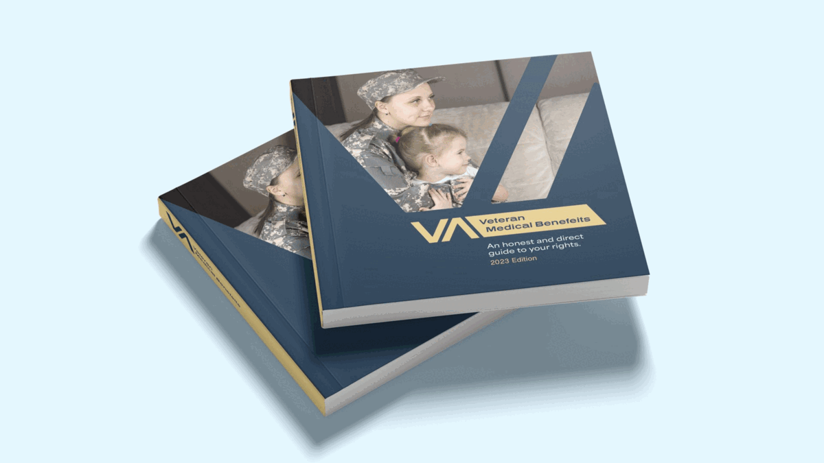
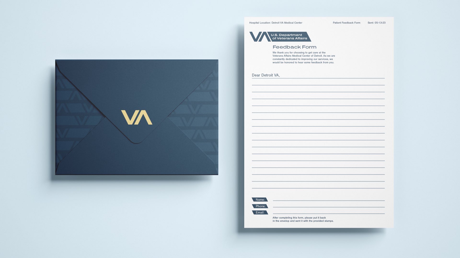
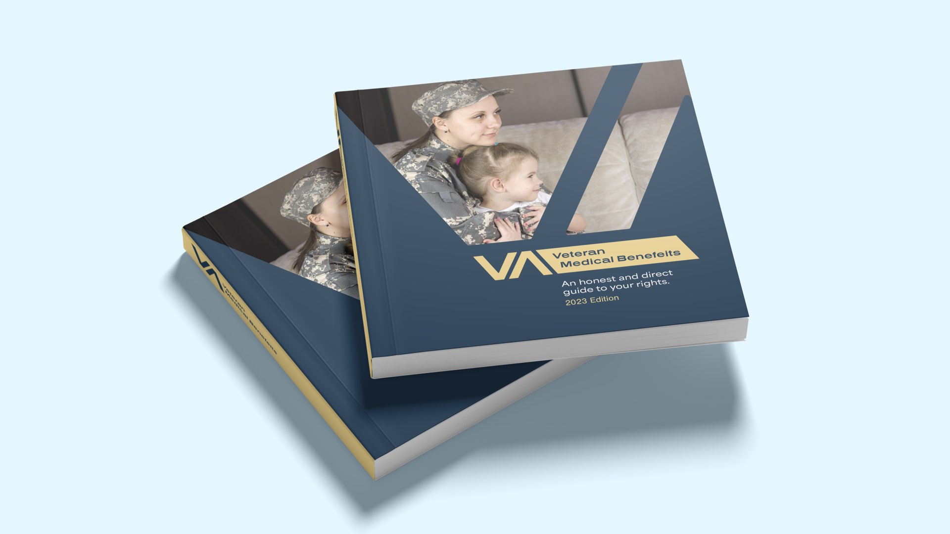
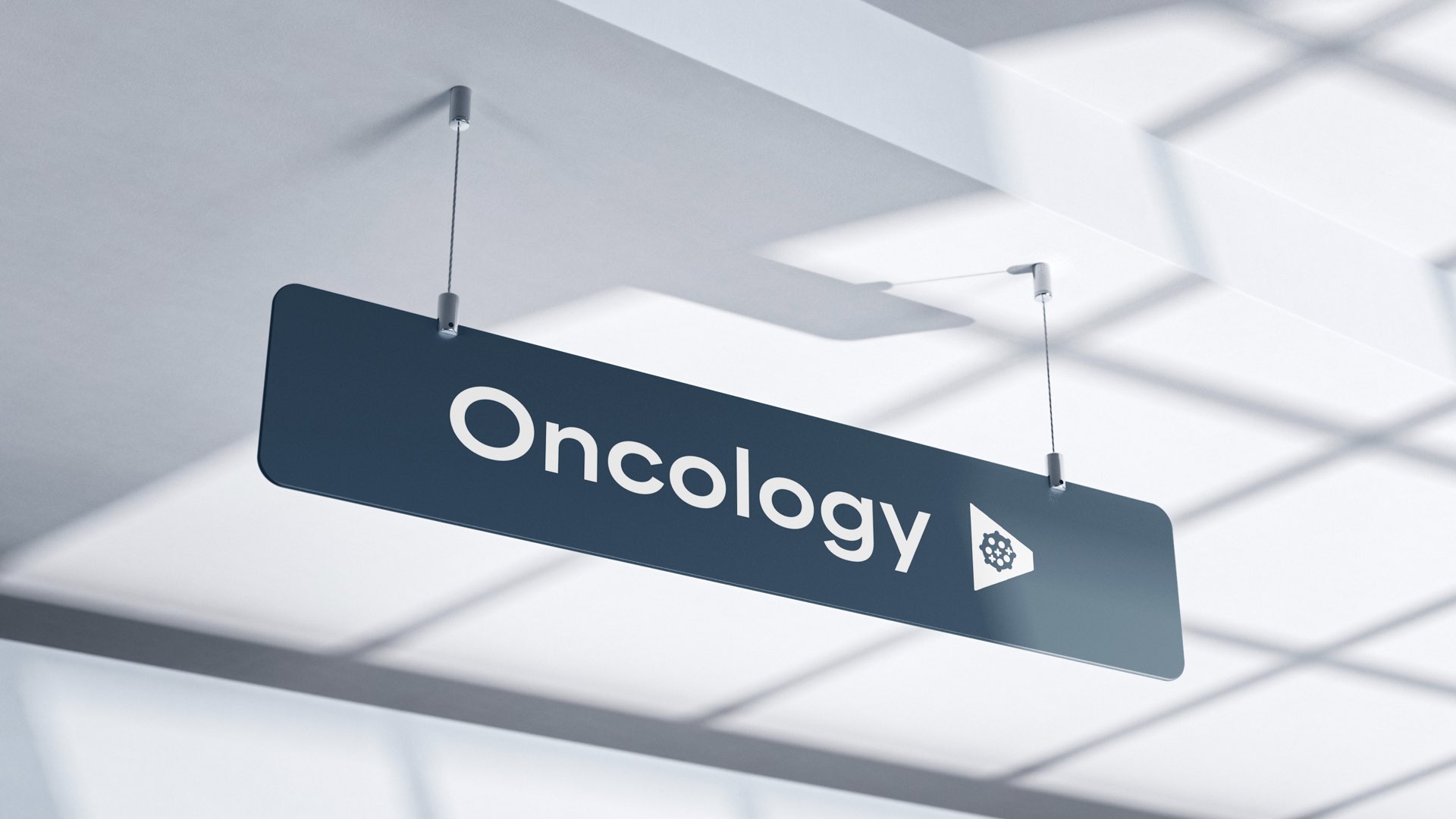
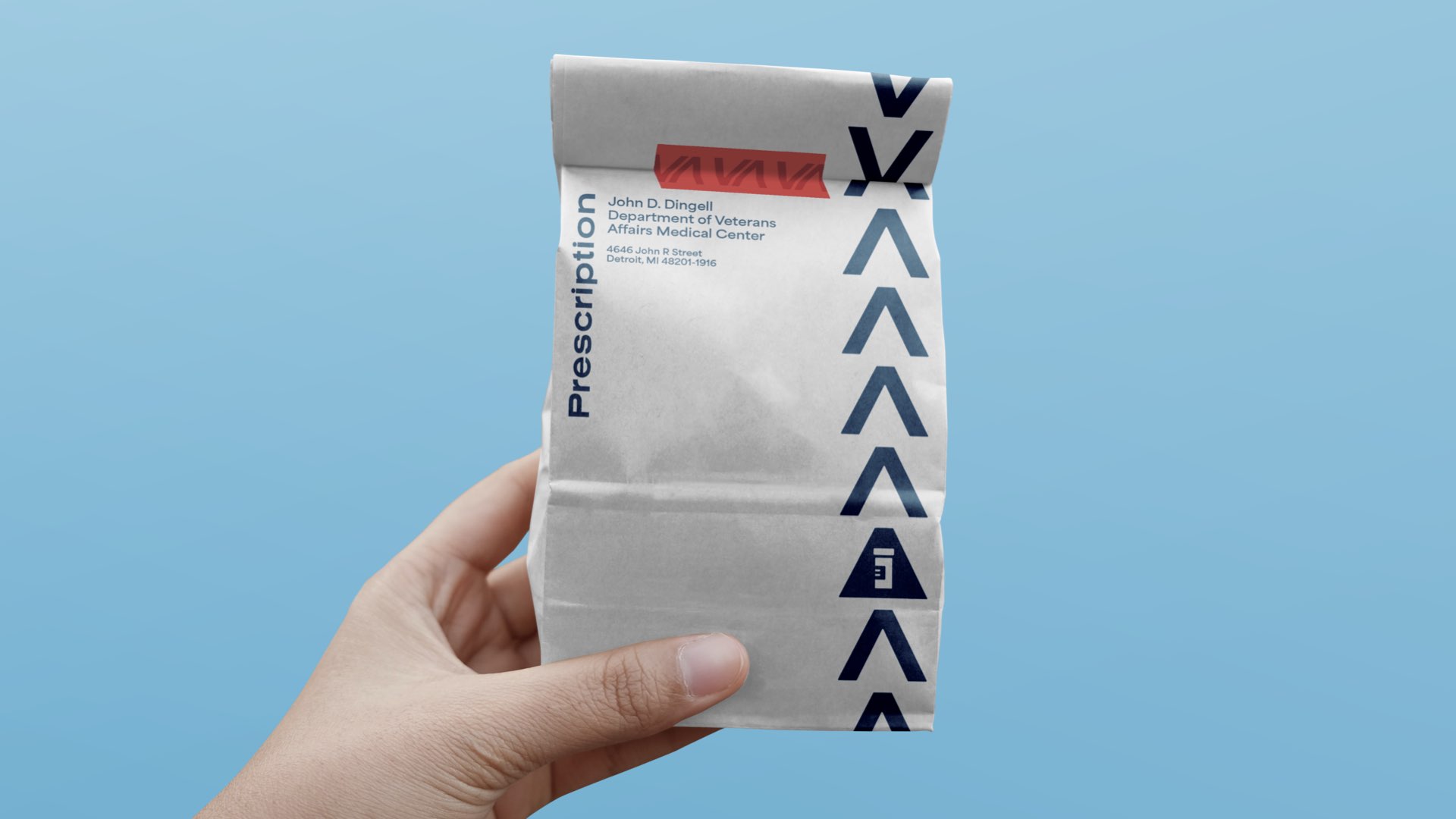
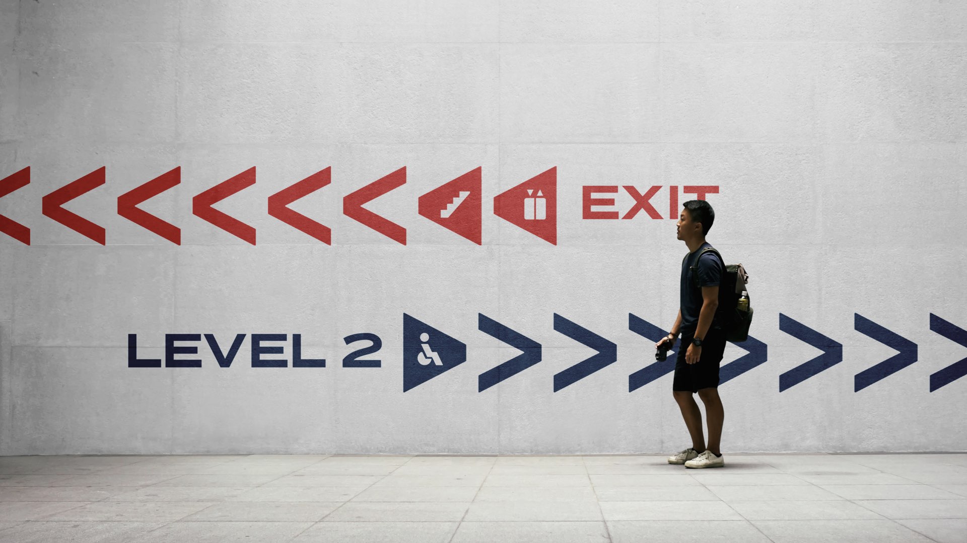
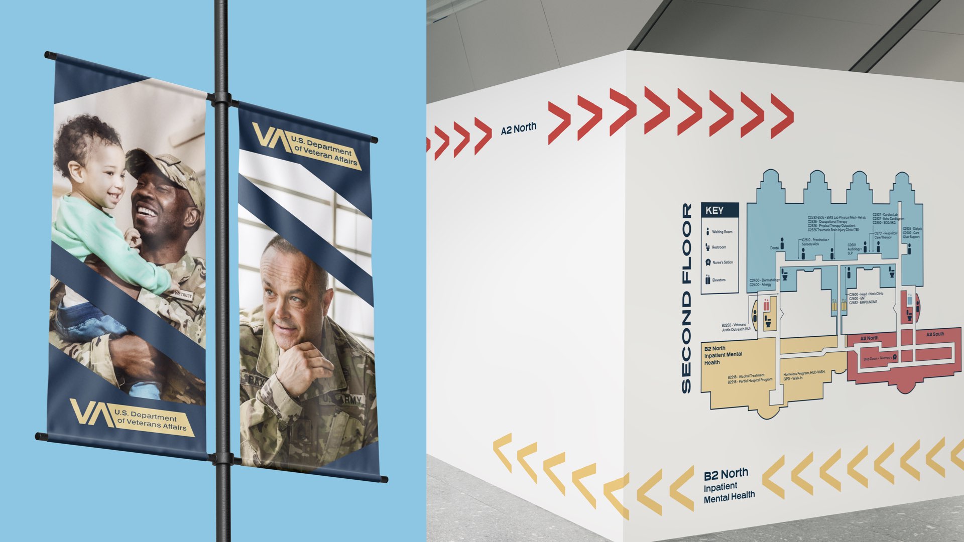
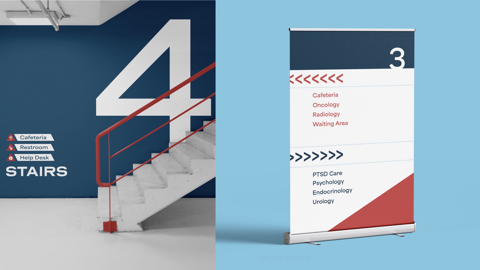
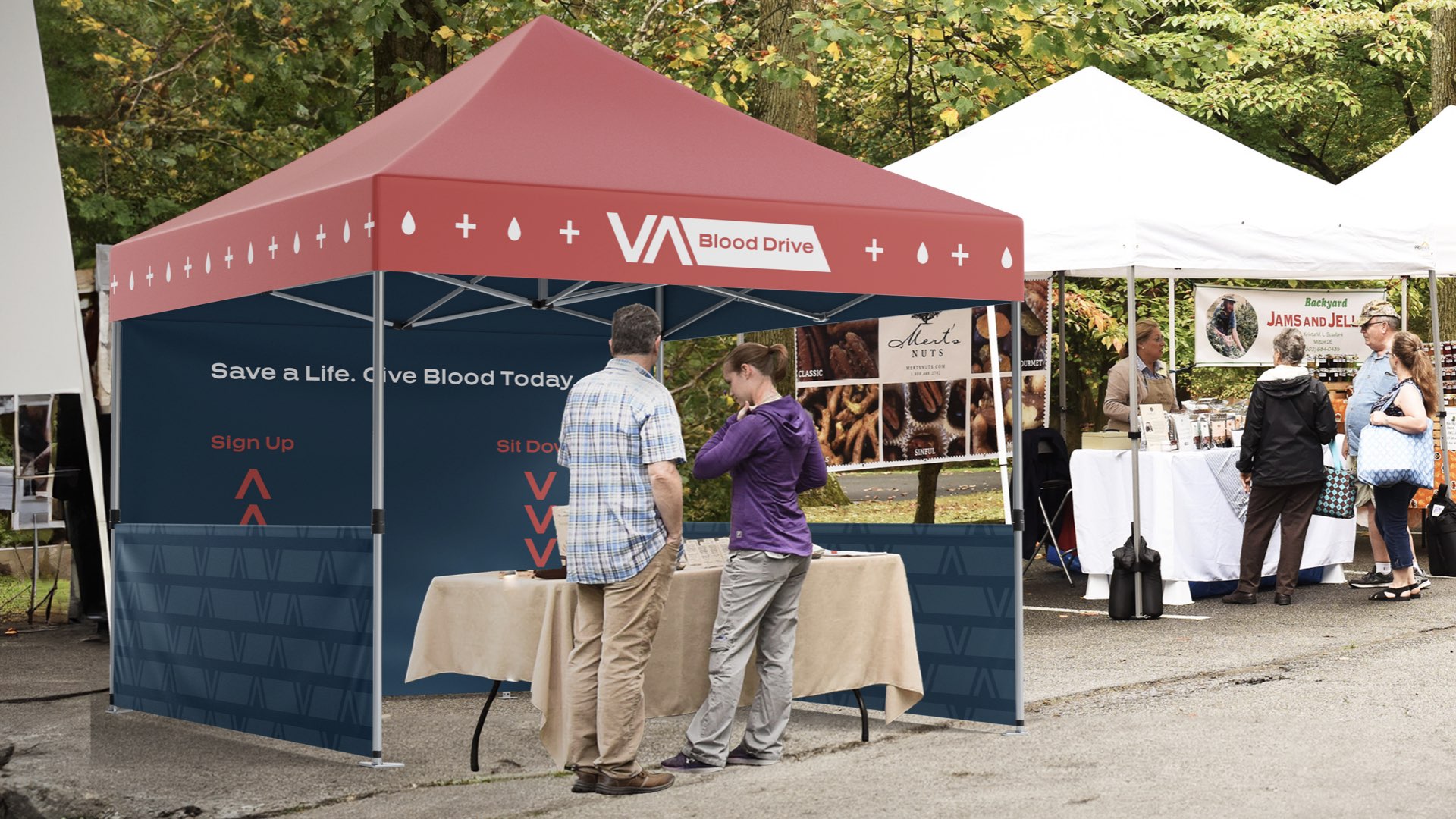
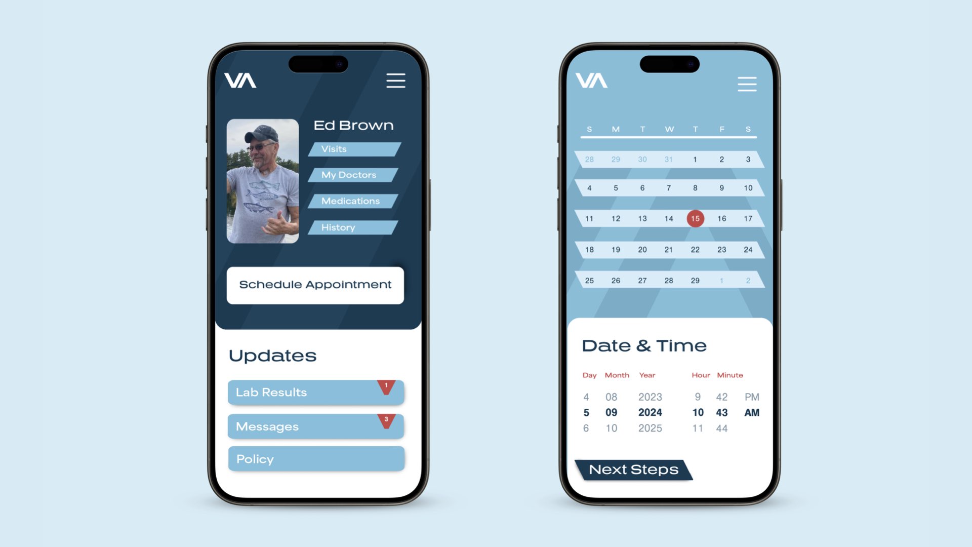
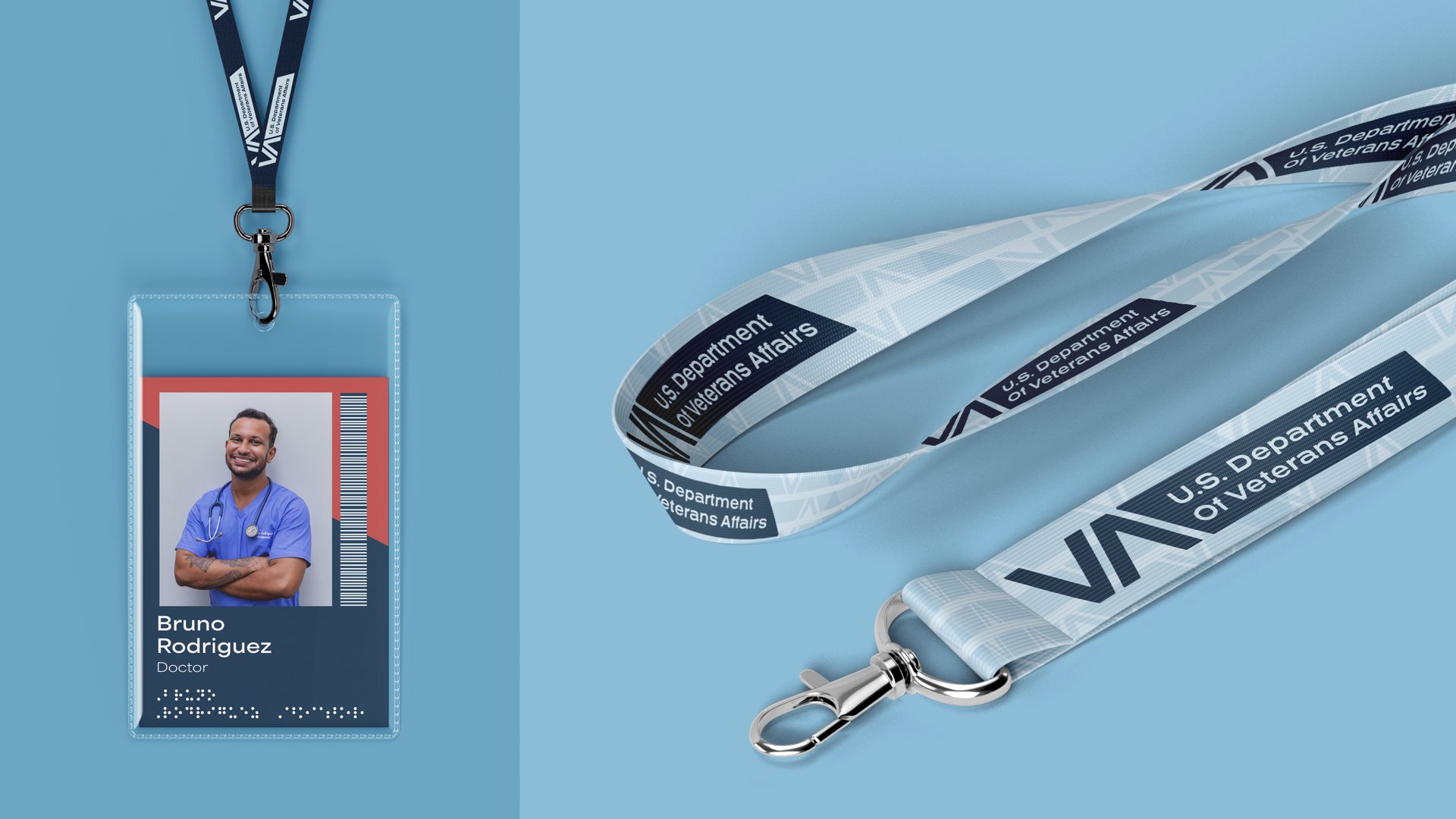
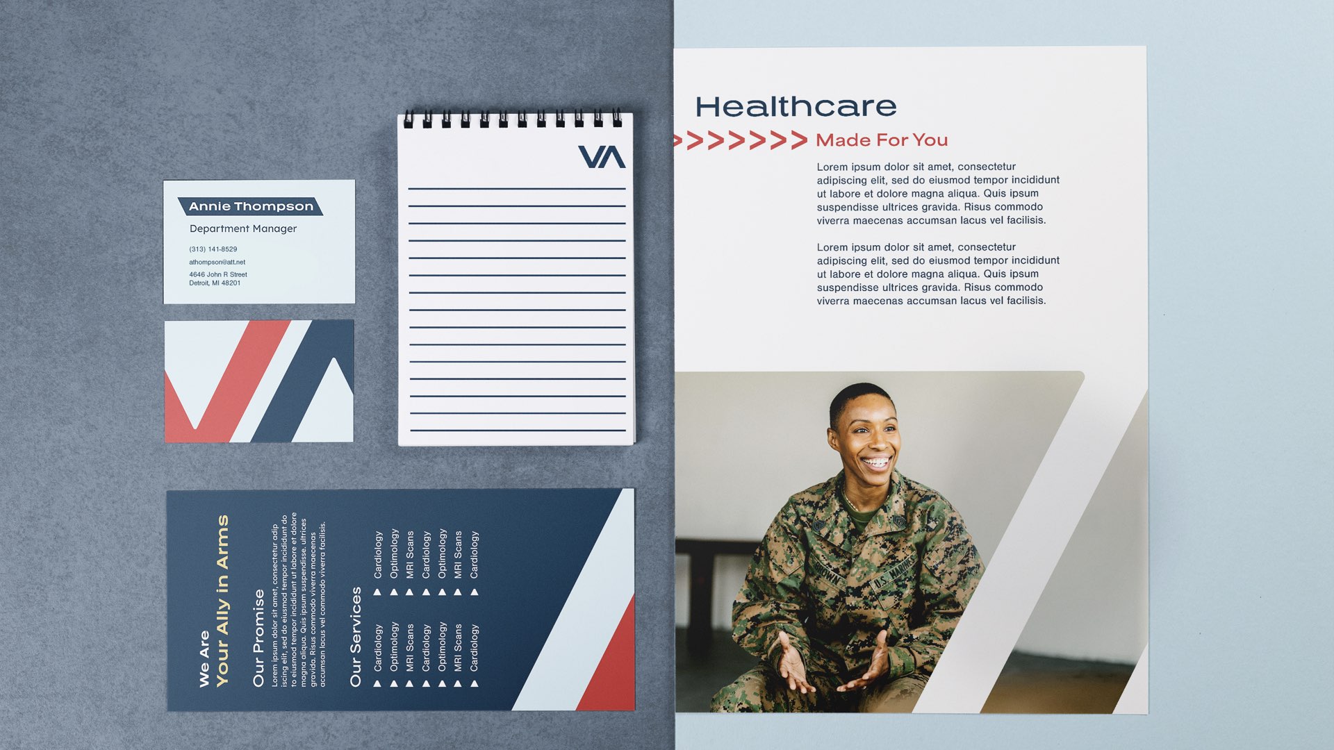
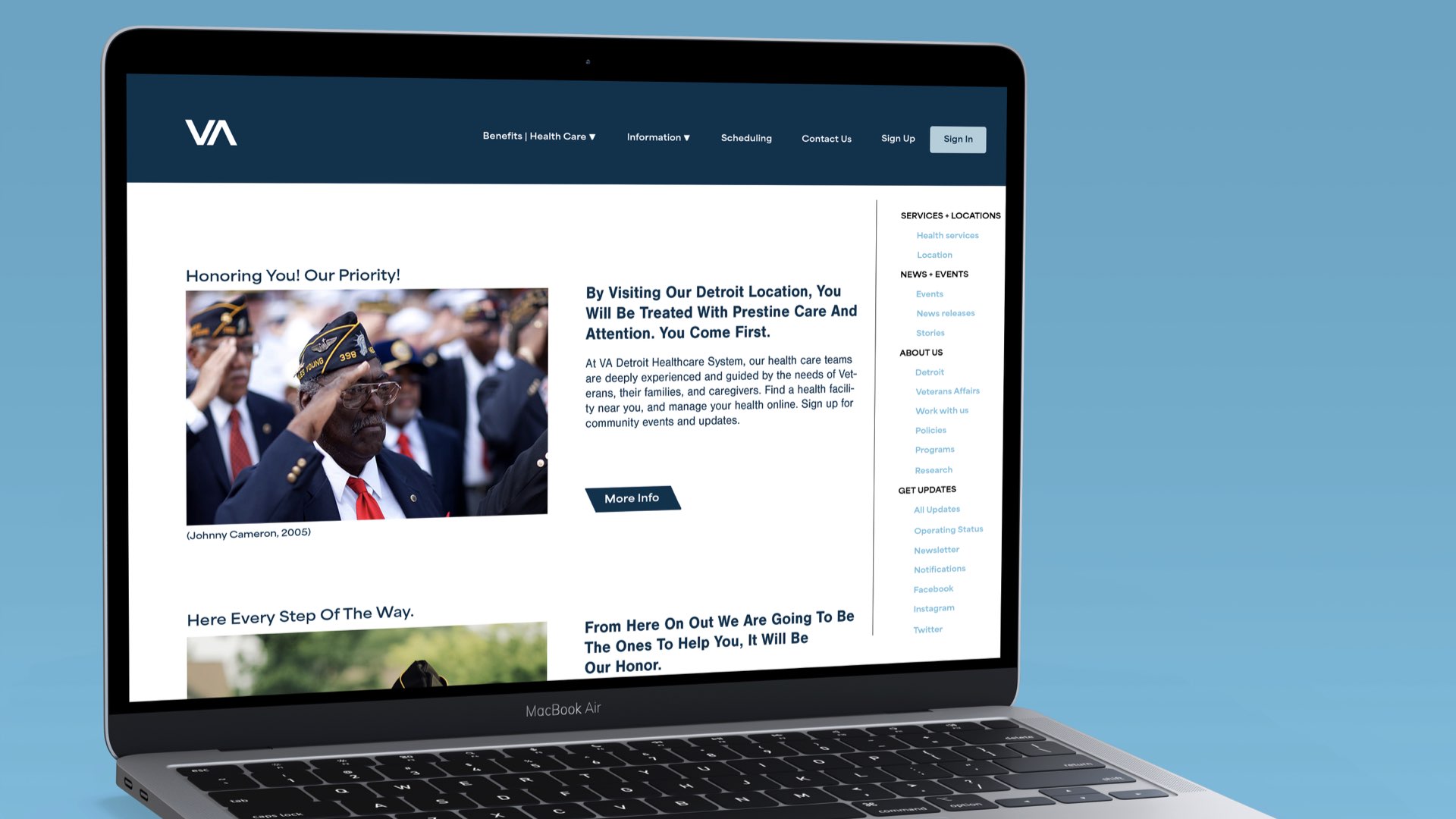
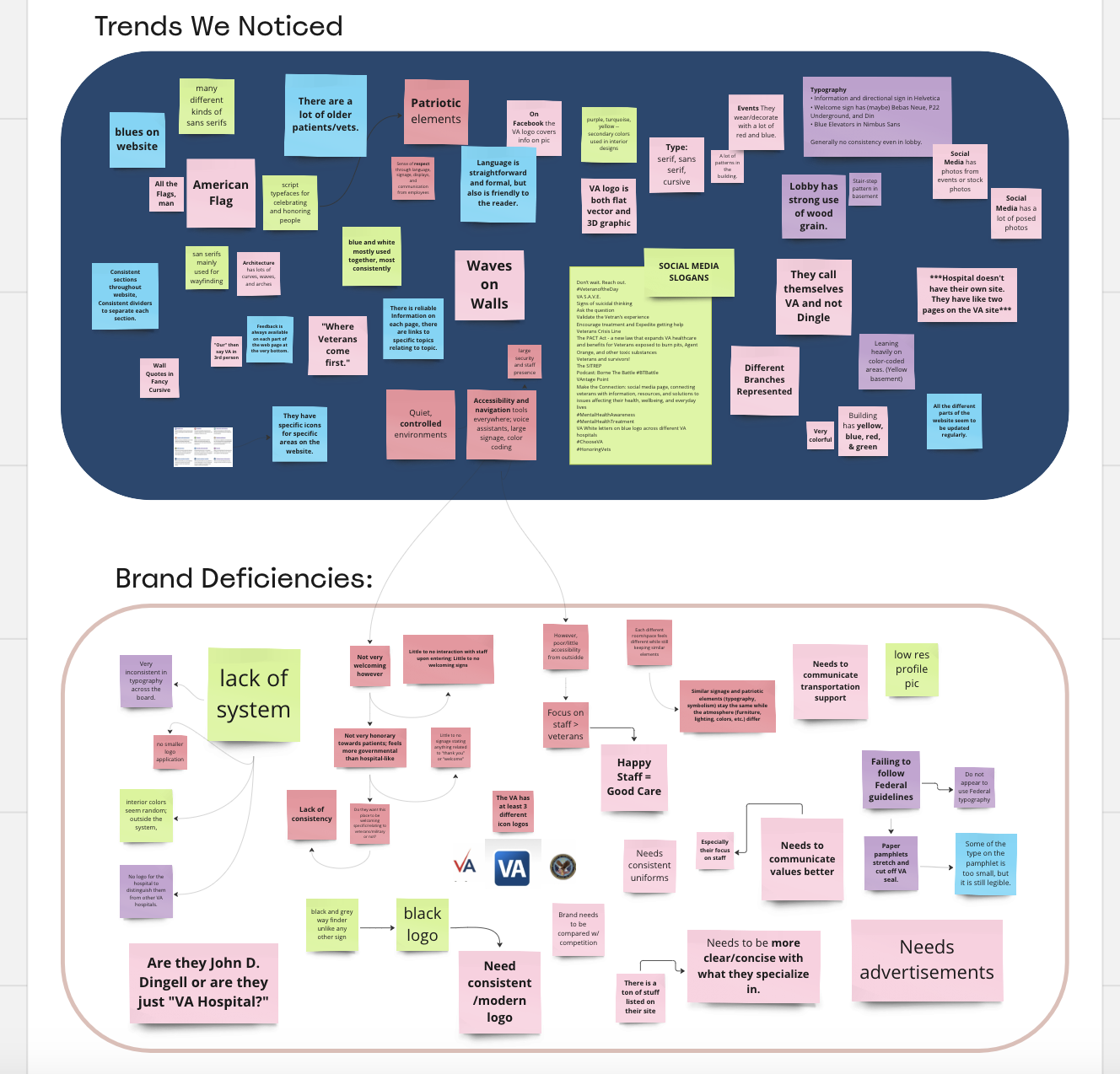
For this group project, we were tasked with branding the Detroit VA Medical Center. As of 2023, the Medical Center lacked good branding, wayfinding, and communication with patients. We wanted to give Detroit VA a memorable identity that aligned with the VA’s brand. We also wanted to make the patients’ experience as accessible and pleasant as possible.


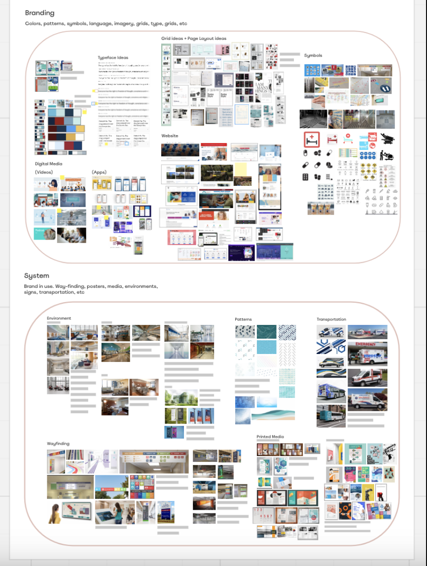
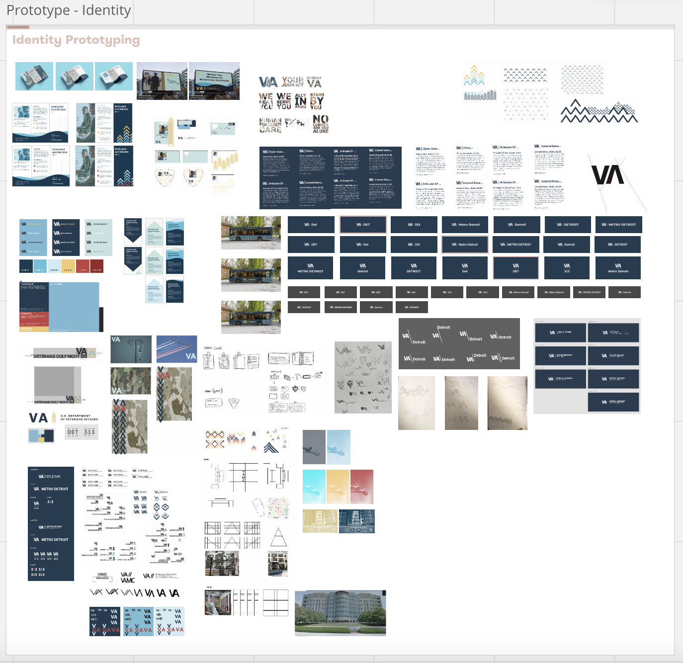
Process
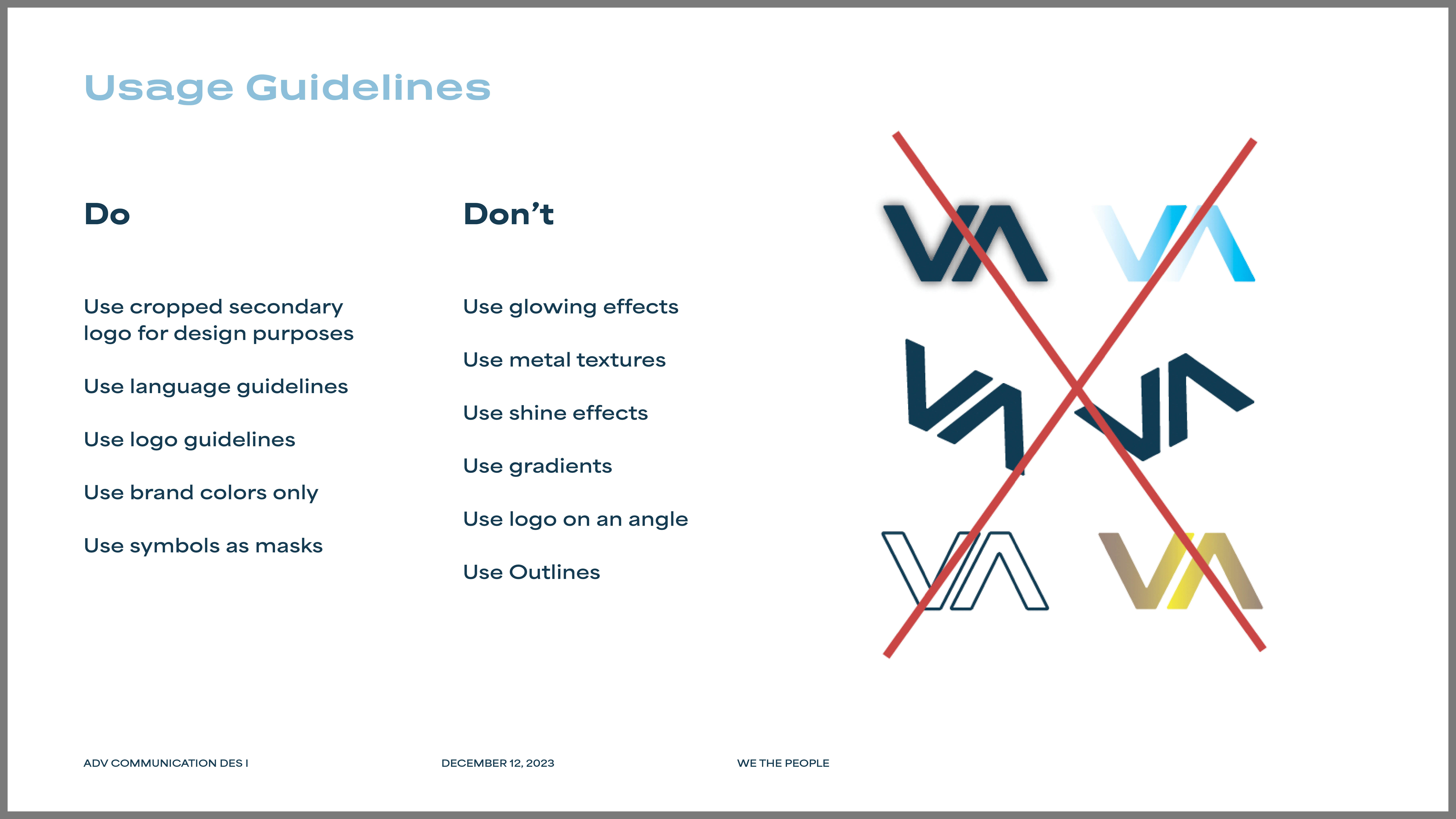
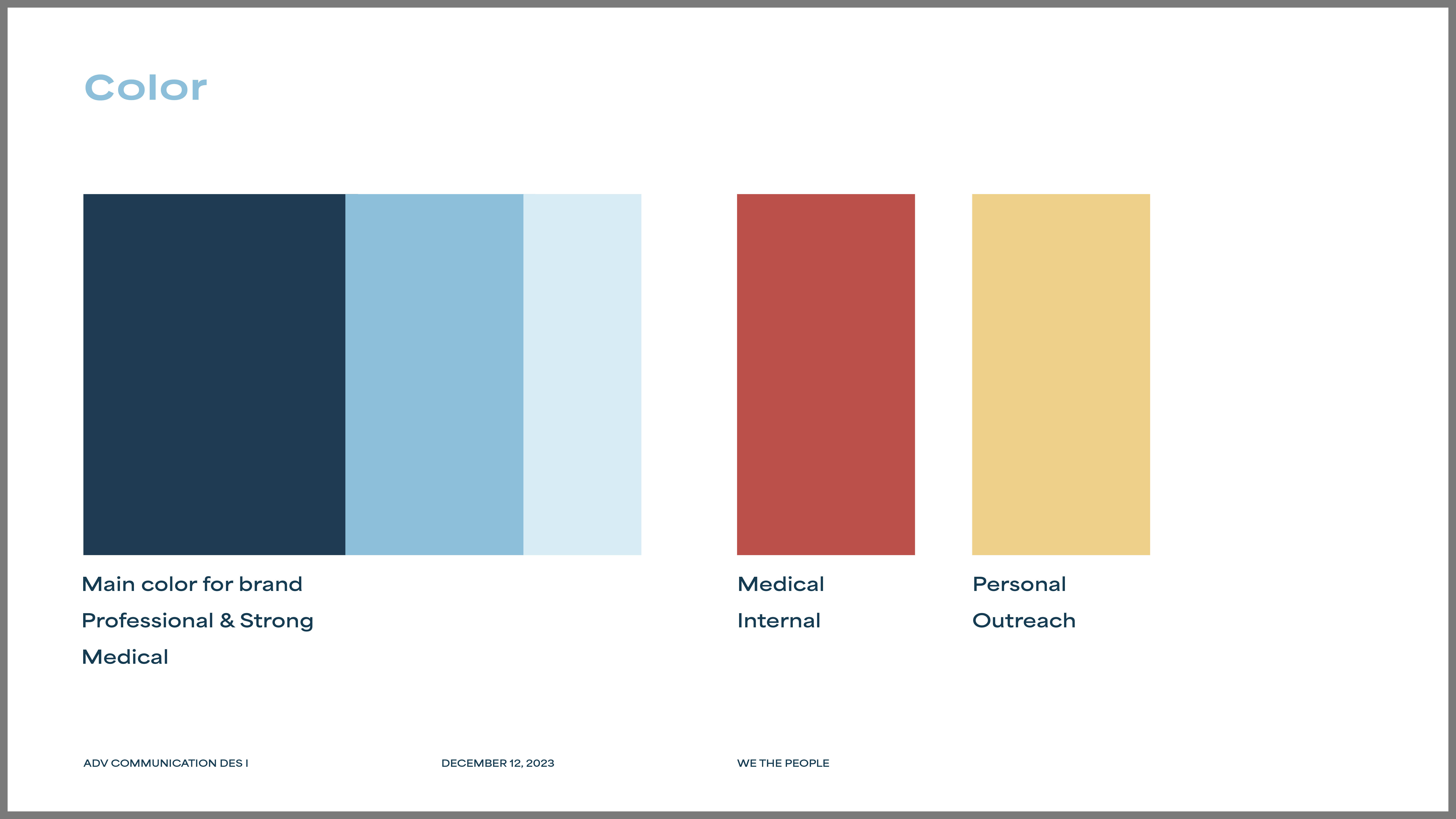
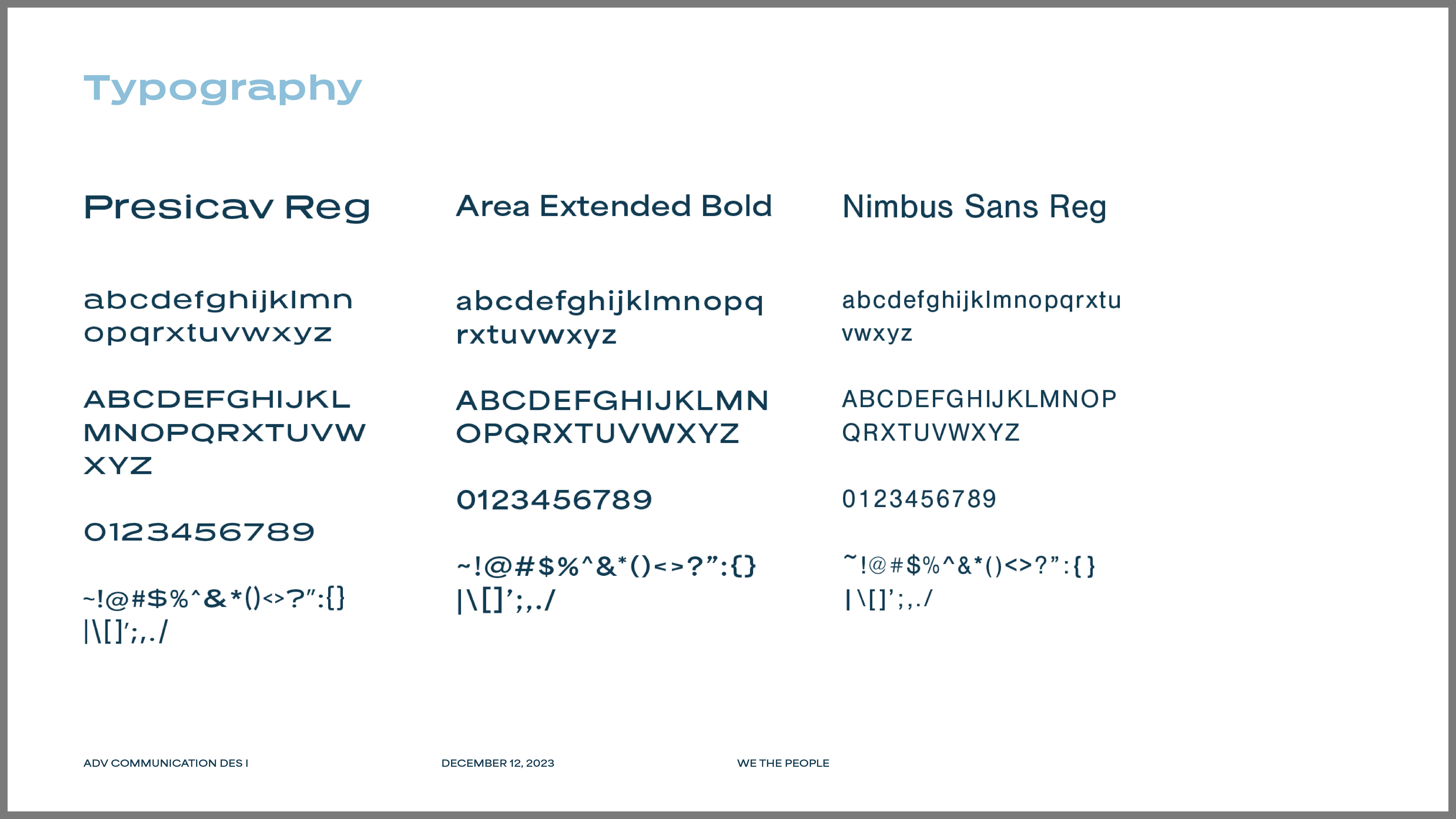
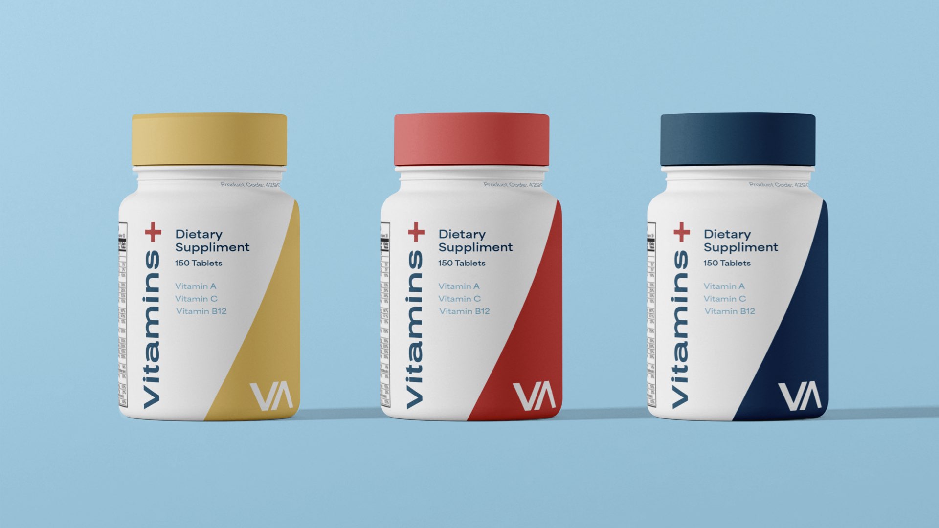
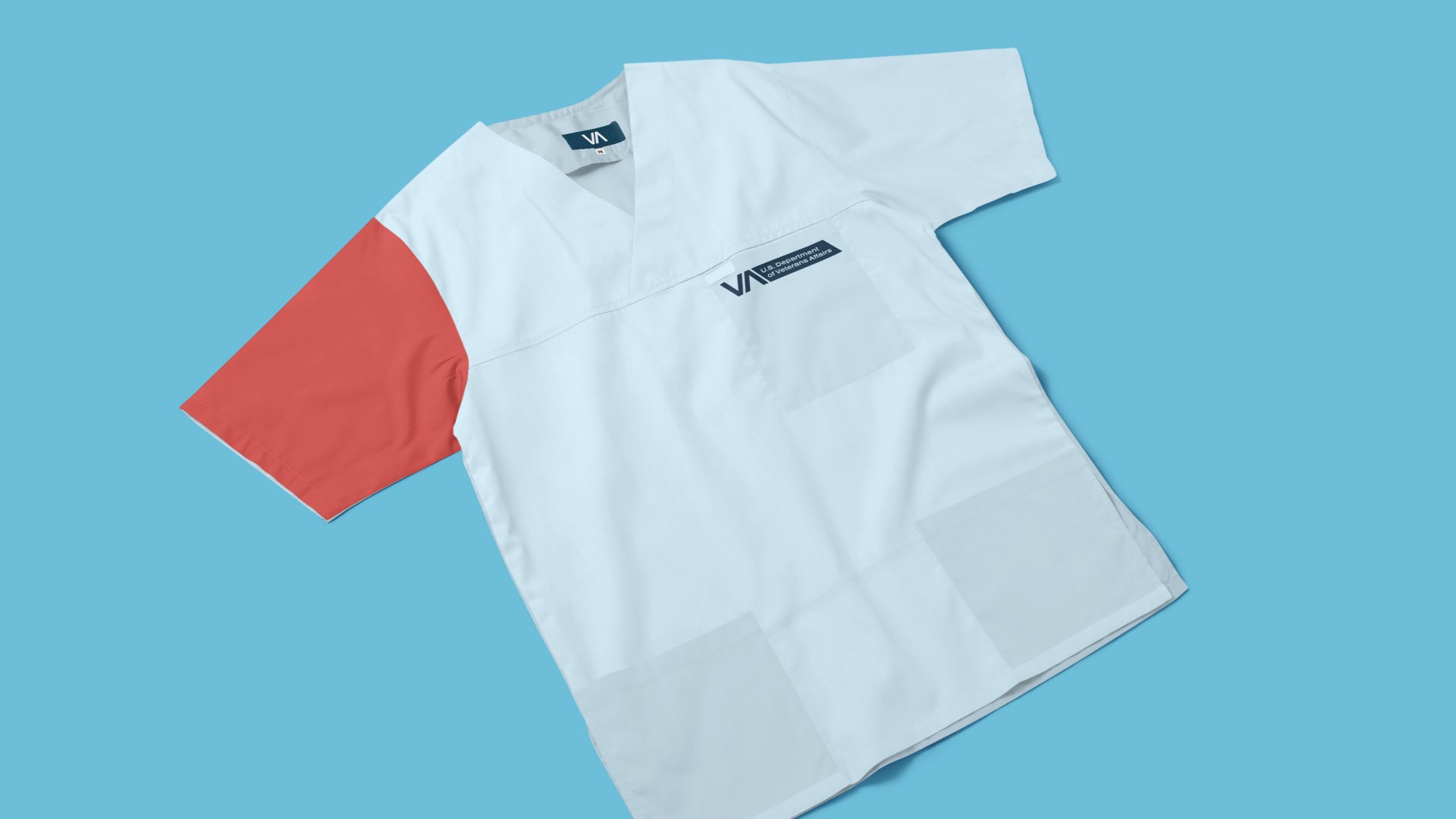
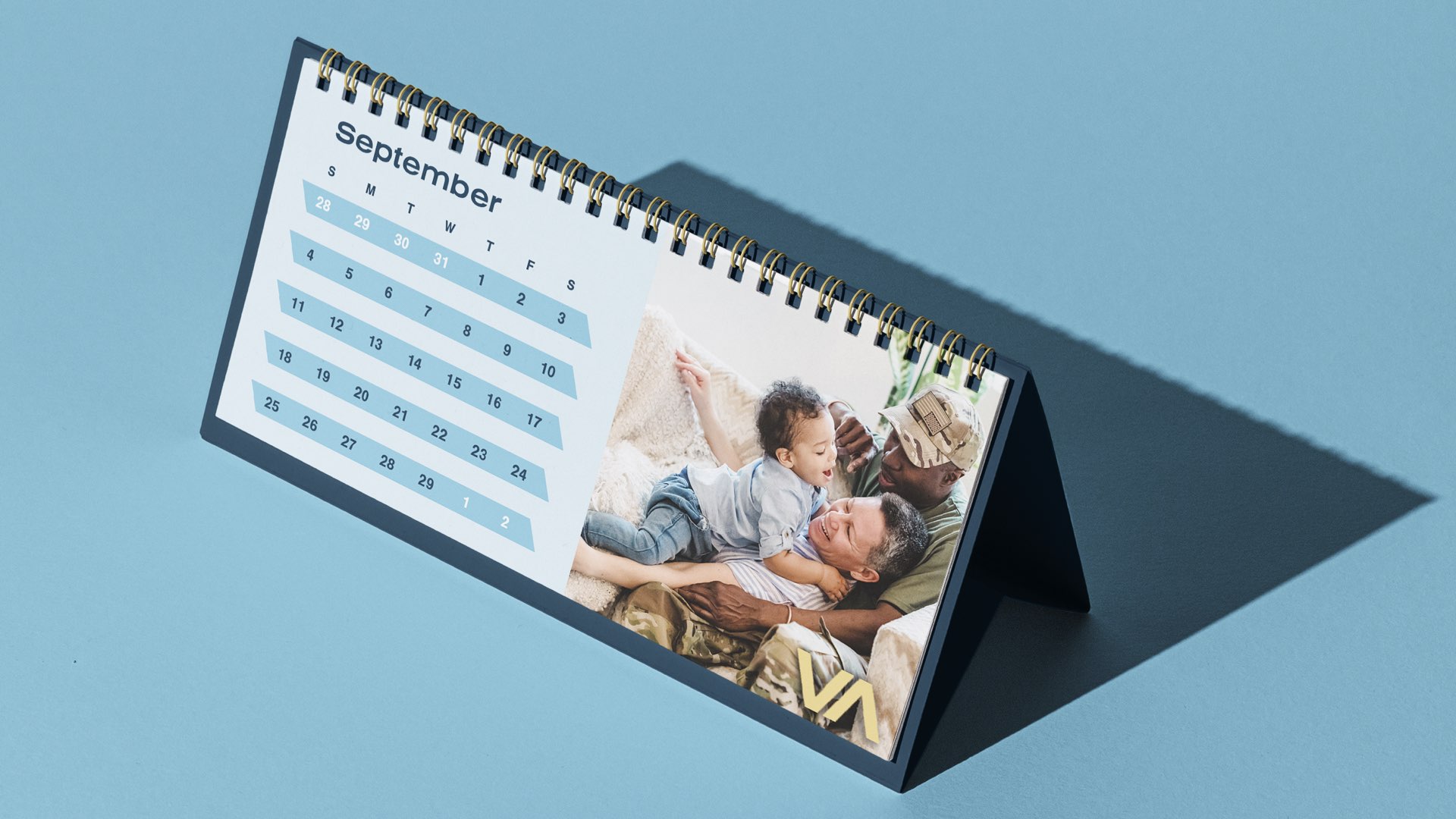
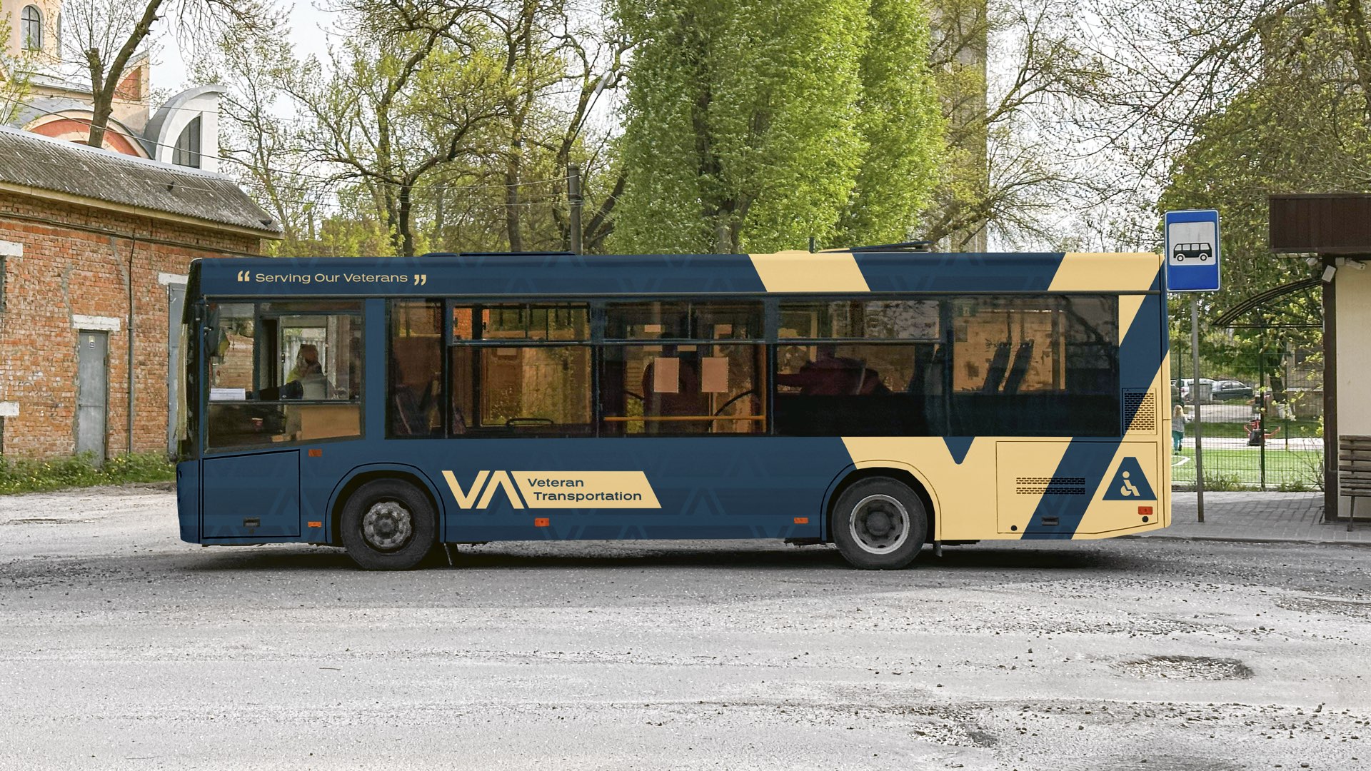
As shown above, we created some brand guidelines for Detroit VA. This helped us as a team stay on the same page, and it helped make the brand consistently recognisable. In our designs, we put a lot of emphasis on our colors having different purposes: red is medical, yellow is outreach, and blue is brand). We also stressed the importance of the logo's meaning: through the downs, through the ups, the VA is here to serve you.


Takeaway
This project was a big learning experience. Our team went through a rollercoaster of critiques to get to our final product. I learned a lot about taking criticism (from both instructors and teammates) and turning it into progress. It was hard at times, but I tried my best to stay optimistic and hype up my teammates—and it all turned out well in the end!
Behind the Scenes


︎︎︎Home Next ︎︎︎