Harris House
Partner:
E.T. Phone HLK
06-10-2023
Tags:
Brand Design, Braned Mockups, Web Design
Channels:
Photoshop, Illustrator, Indesign, Figma
︎︎︎︎︎︎︎︎︎
Tags:
Brand Design, Braned Mockups, Web Design
Channels:
Photoshop, Illustrator, Indesign, Figma
︎︎︎︎︎︎︎︎︎
Objective
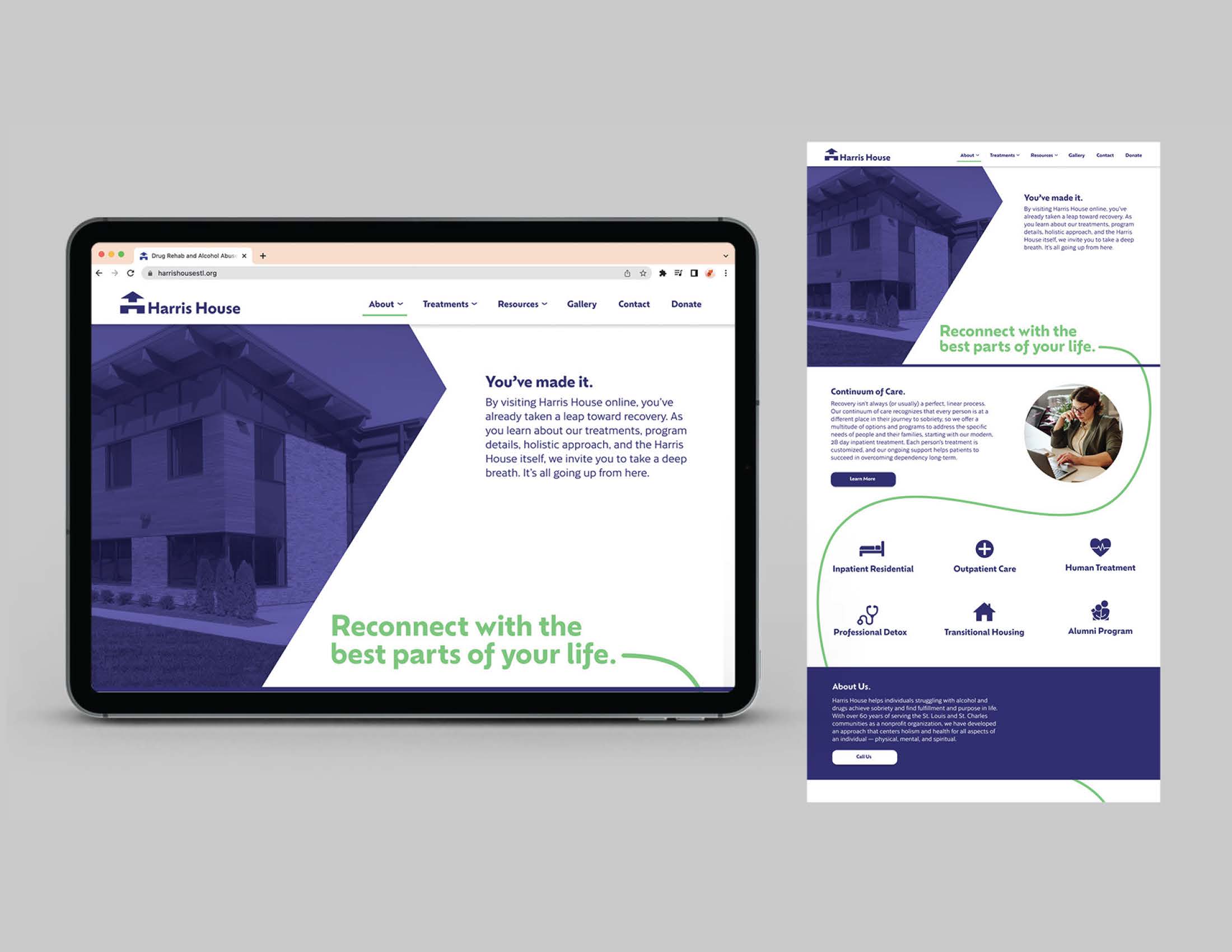
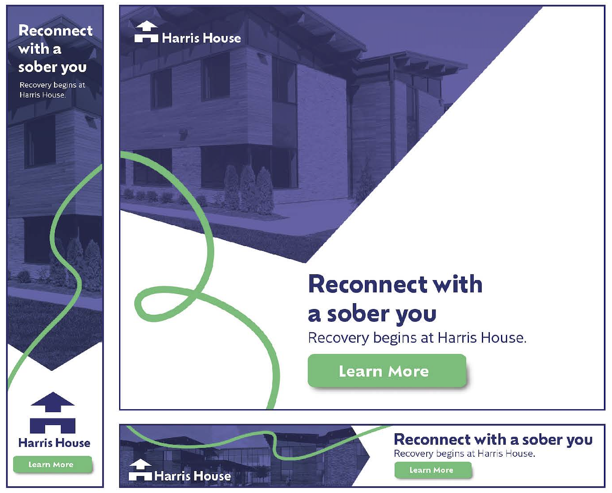
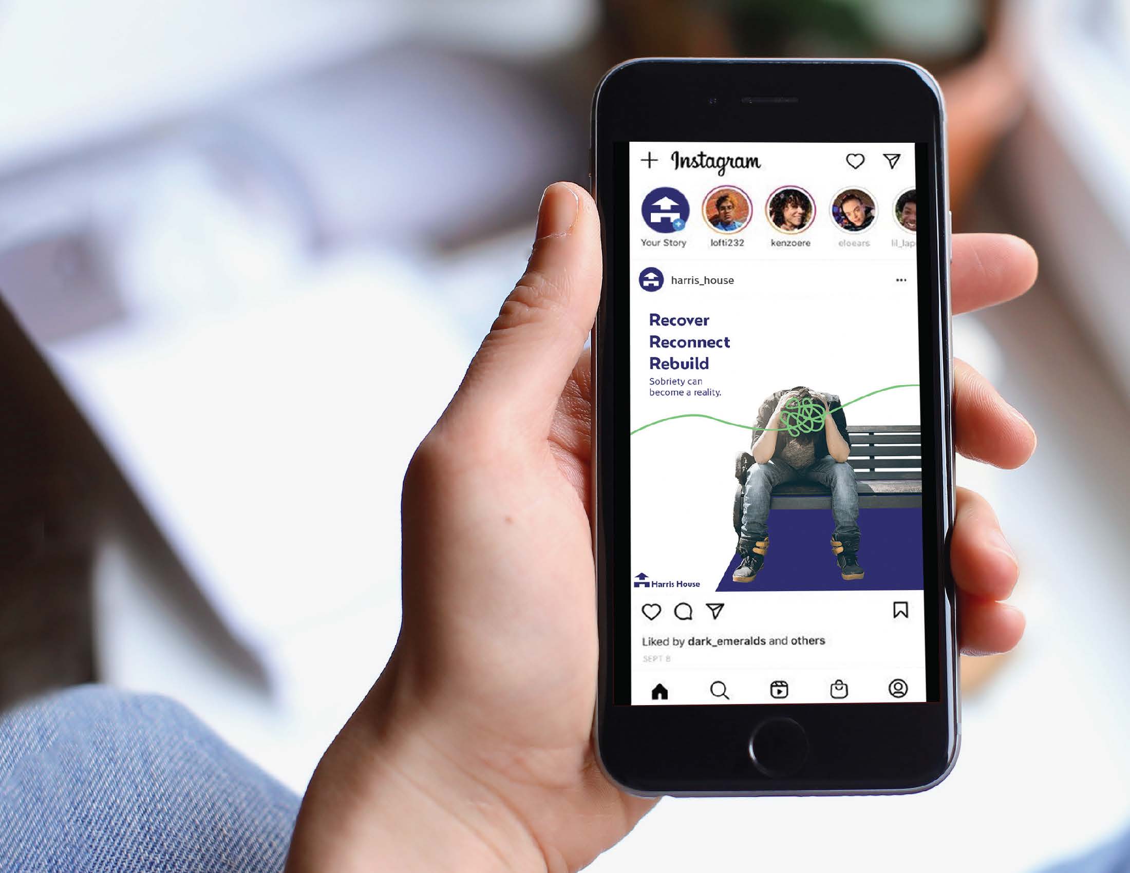
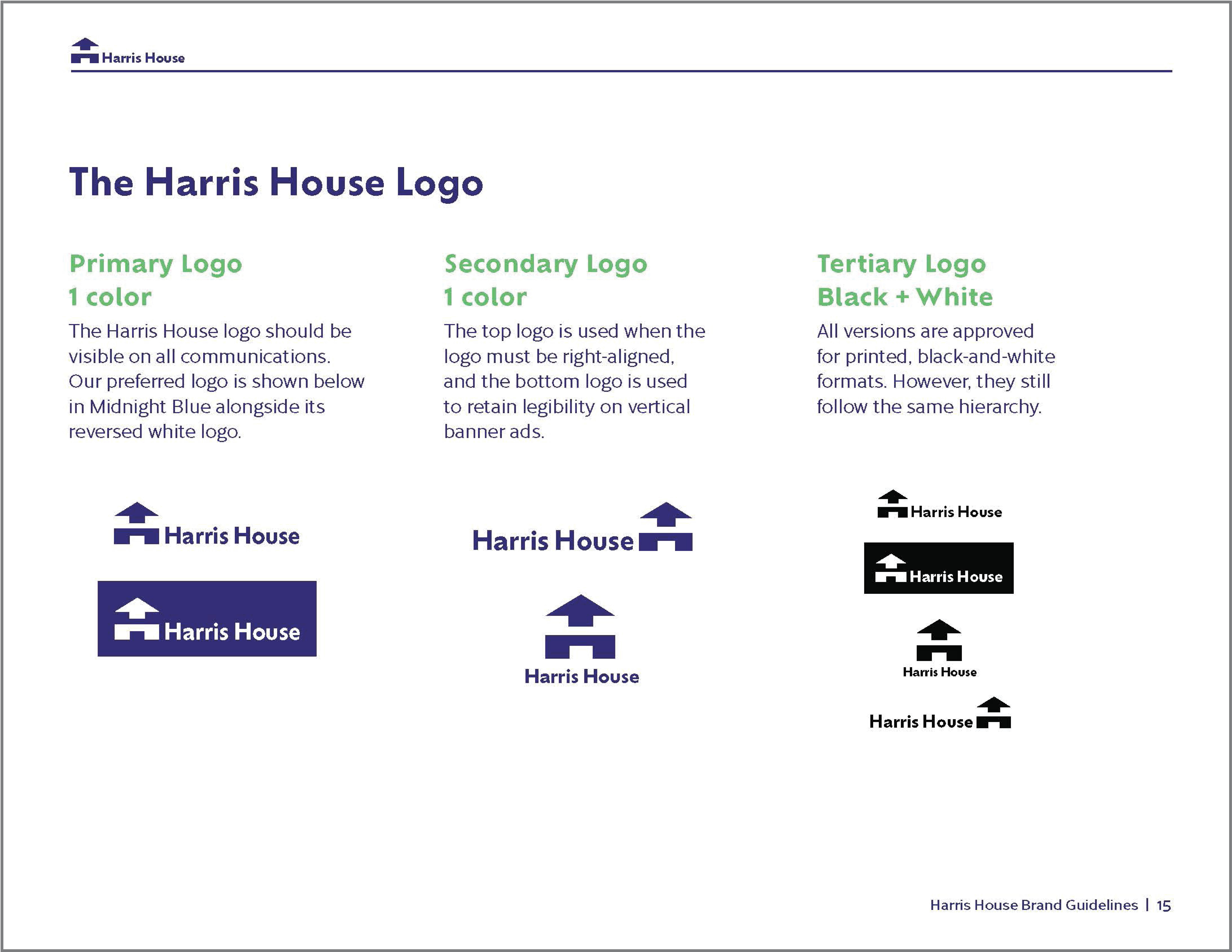
When I worked at HLK with seven other interns, we rebranded Harris House, a rehab facility. My copywriter, Catherine Butler, and I were the only creatives on said team. My main goal during this project was to make Harris House stand out against its competition and emphasize the brand’s new “Reconnection through recovery” tagline.




Process
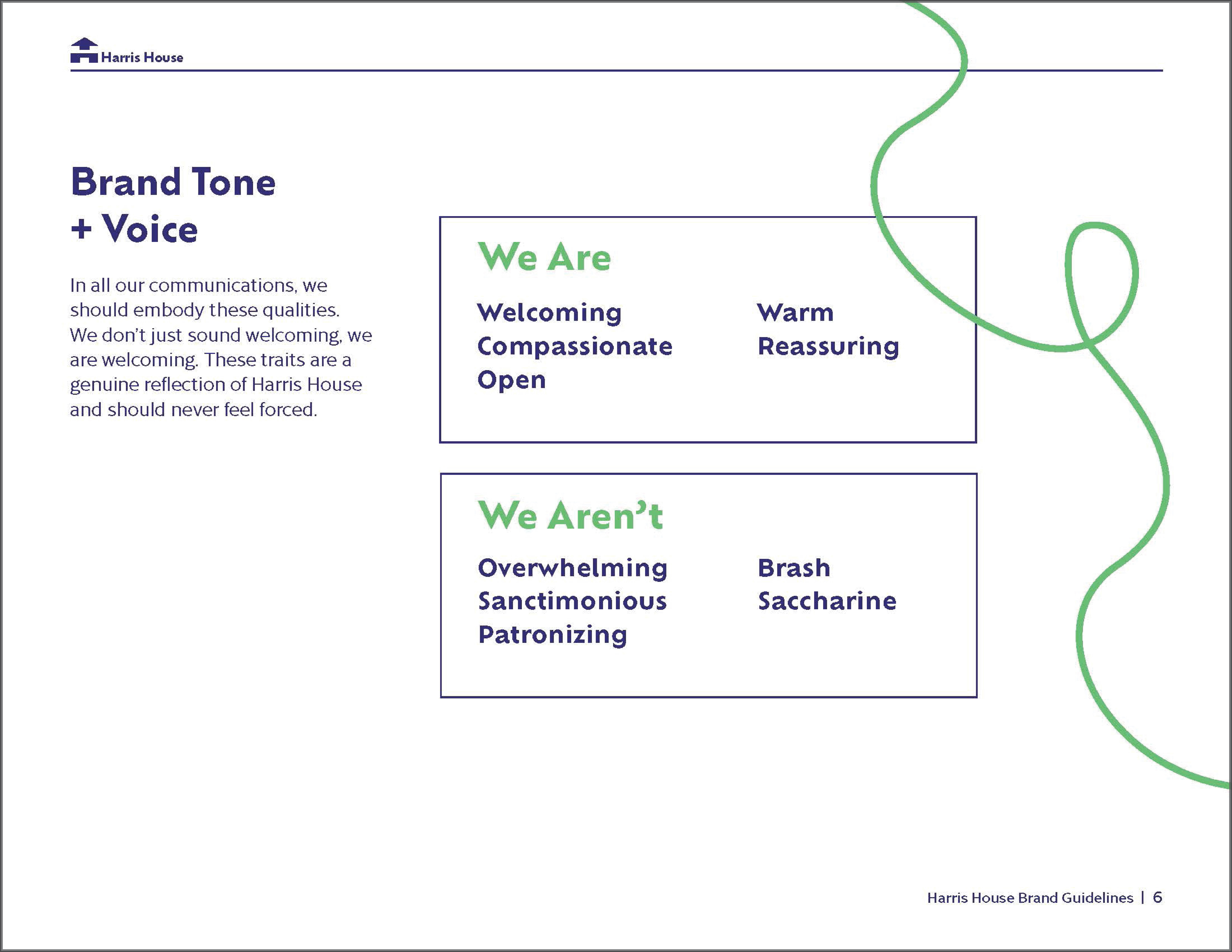
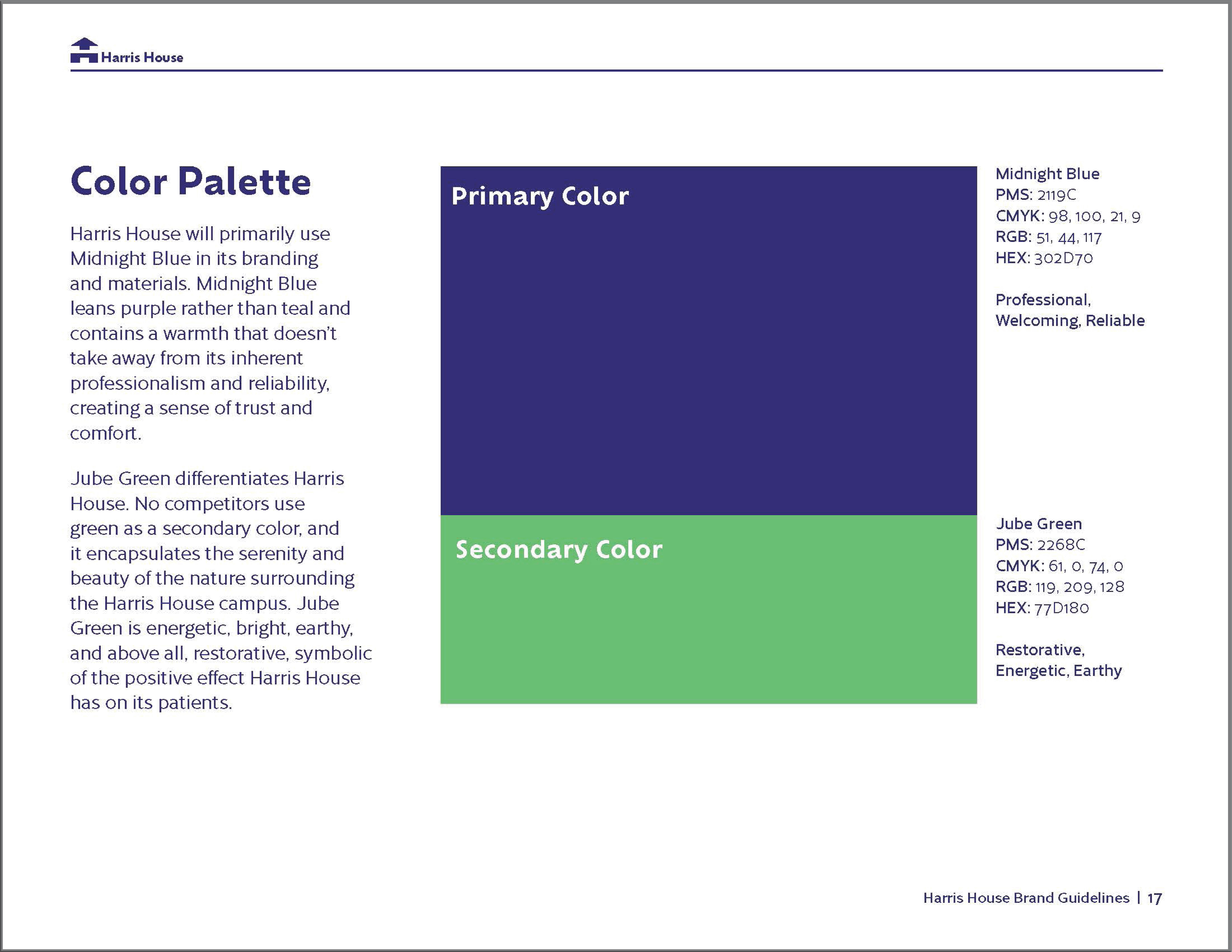
Harris House’s main request was to make its brand more consistent. I selected a shade of blue that stood out from the rest of the “blue” competitors. I also made the bold decision to have the secondary color be jade green because every other brand used warm tones. I intentionally used the green sparingly to highlight text and illustrate a metaphorical “path of recovery and reconnection.”





Takeaway
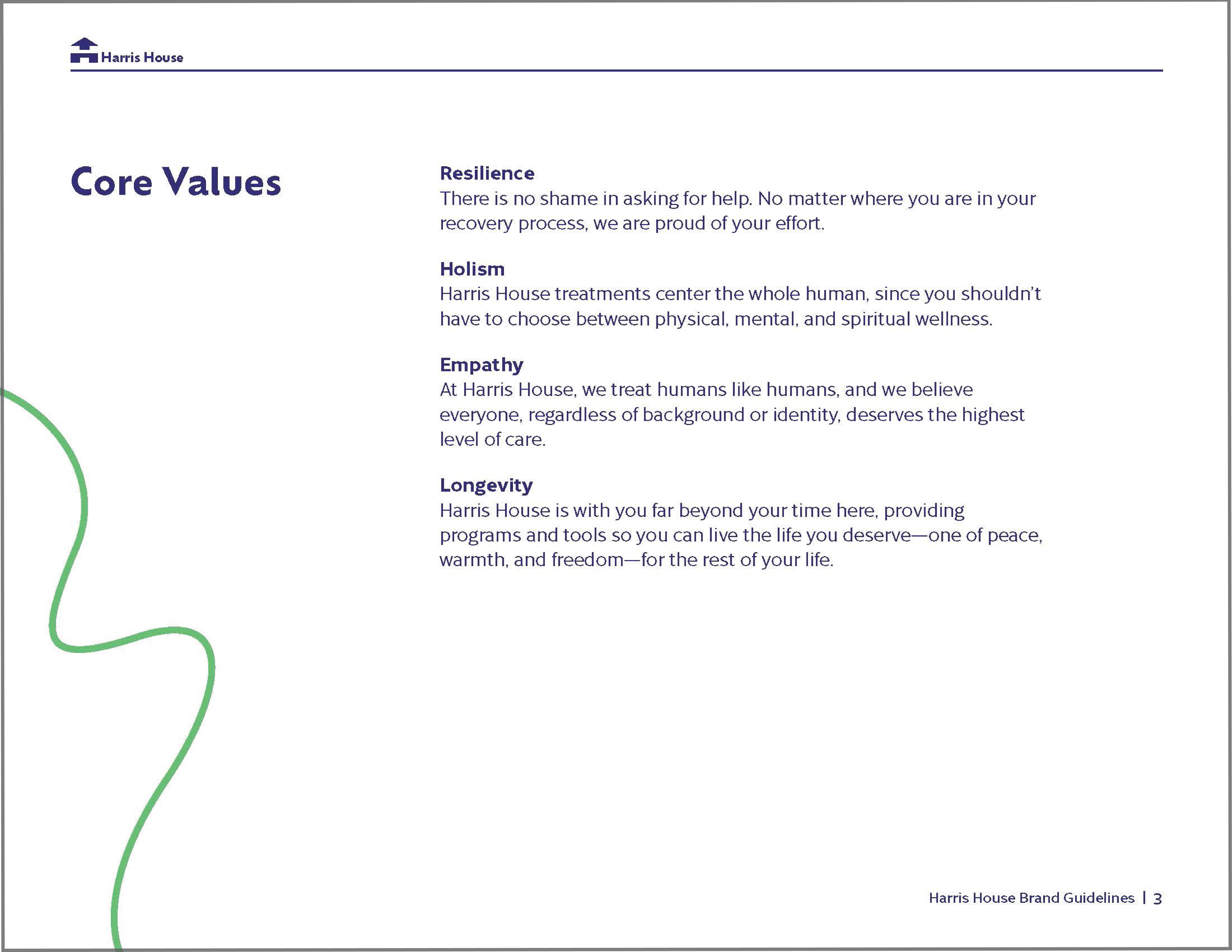
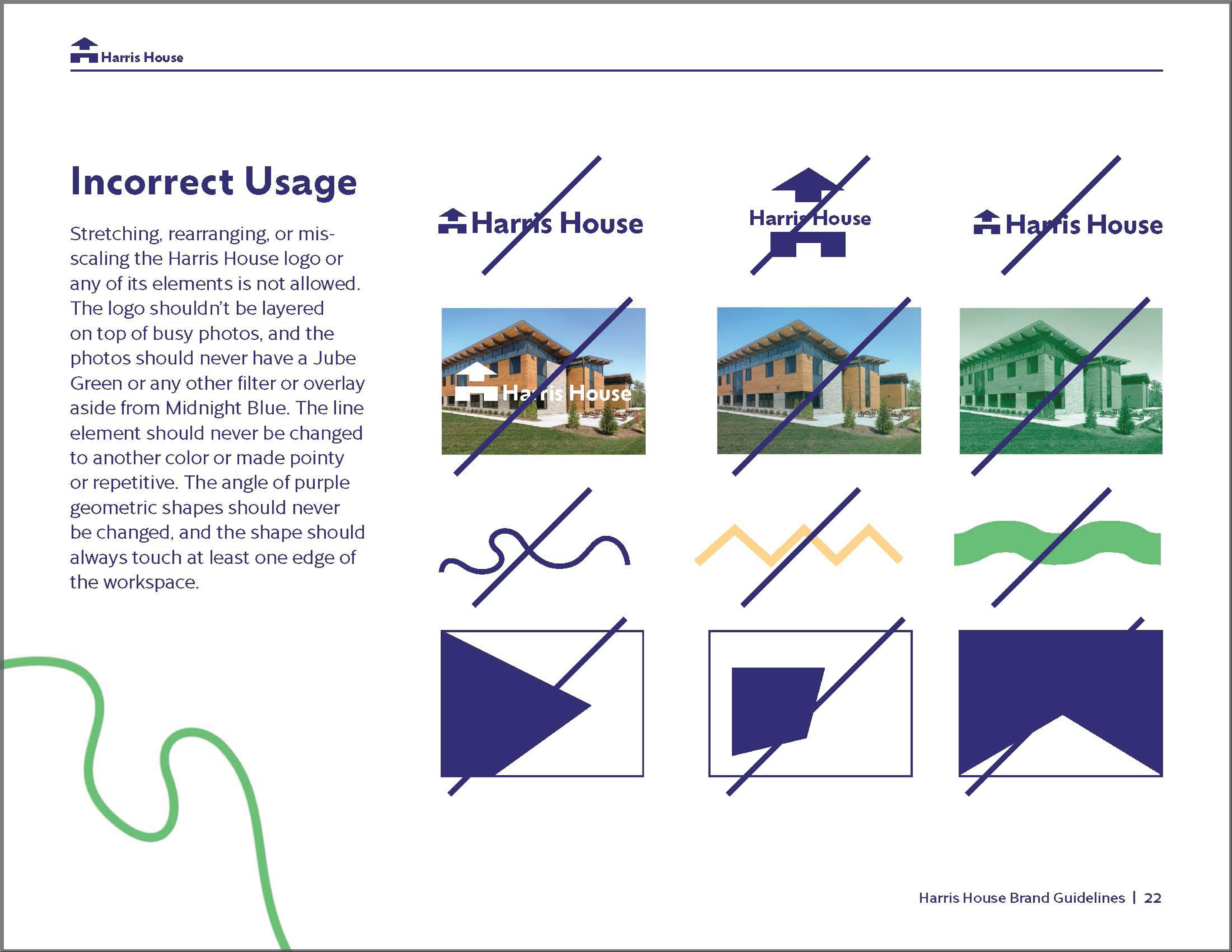
Designing Harris House’s brand was a great experience and a worthy challenge. This was my first time making brand guidelines, so I learned a ton about making it “dummy proof,” detailed, and easy to digest.
︎︎︎Home Next ︎︎︎
